
PulpPlant is an innovative sustainable packaging company that specializes in eco-friendly, nature-approved packaging solutions. This comprehensive brand identity project showcases a complete visual system designed to communicate the company's commitment to environmental sustainability and natural packaging alternatives.
Brand Concept & Philosophy
The PulpPlant brand represents a revolutionary approach to packaging, moving away from traditional plastic and synthetic materials toward biodegradable, plant-based alternatives. The company focuses on creating packaging solutions that are not only functional but also environmentally responsible, aligning with the growing global demand for sustainable business practices.
Logo Design Analysis
Symbol Design
The core logo features a stylized tree silhouette enclosed within a perfect circle, creating a powerful symbol of:
Environmental stewardship - The tree represents growth, sustainability, and natural cycles
Circular economy - The circular frame symbolizes the closed-loop system of sustainable packaging
Brand unity - The contained design creates a strong, recognizable brand mark
Color Palette
The brand employs a sophisticated green color system:
Deep Forest Green - Represents maturity, reliability, and environmental commitment
Fresh Lime Green - Symbolizes growth, innovation, and natural vitality
Natural Gradient Tones - Create depth and organic feel throughout the brand materials
Typography
The "PulpPlant" wordmark uses clean, modern typography that:
Balances professionalism with approachability
Maintains readability across various applications
Complements the organic nature of the tree symbol
Brand Applications Showcased
Business Cards
The business card design demonstrates sophisticated brand application:
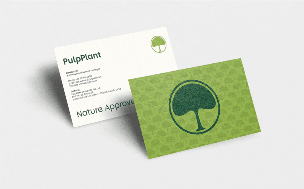
Front Side: Features the prominent tree logo on a textured green background, creating immediate brand recognition
Back Side: Clean white layout with "Nature Approved" messaging and complete contact information
Material Consideration: Designed for implementation on sustainable, recycled paper stocks
Brand Pattern
The first image reveals an intricate pattern design using repeated tree motifs, creating:
Versatile background elements for various marketing materials
Cohesive brand experience across touchpoints
Scalable design that works from business cards to large-format applications
Design Strategy & Market Positioning
Target Market
PulpPlant positions itself for:
Eco-conscious businesses seeking sustainable packaging alternatives
Food and beverage companies prioritizing environmental responsibility
E-commerce brands wanting to reduce their carbon footprint
Companies targeting environmentally aware consumers
Competitive Advantages Communicated
The brand design effectively communicates:
Authenticity - Genuine commitment to environmental values
Innovation - Modern solutions for traditional packaging challenges
Quality - Professional presentation that doesn't compromise on sustainability
Trust - Reliable, nature-approved processes and materials
Technical Design Considerations
Scalability
The logo system is designed to work effectively:
From small favicon sizes to large signage applications
In single-color applications for cost-effective printing
Across digital and print media
Versatility
The brand system includes:
Primary full-color versions
Monochromatic alternatives
Reversed-out applications for dark backgrounds
Simplified versions for small-scale applications
Brand Messaging Integration
The "Nature Approved" tagline reinforces the brand's core values:
Emphasizes natural validation over artificial certification
Suggests products that work in harmony with natural systems
Creates emotional connection with environmentally conscious consumers